Manon Designs Now
If you have seen the beautiful promotional video for English National Ballet’s Manon, with Alina Cojocaru and Isaac Hernández, you cannot fail to have been struck by the location and designs: the building through which the dancers move, with their longing glances and soft sensuous caresses, is furnished with plush deep red drapes and sparkling chandeliers; and yet, at the same time, it shows signs of disrepair in the crumbling walls and ragged upholstery.
This video, lasting only 32 seconds, encapsulates some of the driving themes of the three-act ballet by Kenneth MacMillan, choreographed in 1974. Based on the 1731 novel by Abbé Prévost entitled Histoire du Chevalier des Grieux et de Manon Lescaut, the ballet is frequently described as a tale of Manon’s struggle between love and riches, for example on the current ENB promotional flier: “The young and naïve Manon is torn between two lives: privilege and opulence with the wealthy Monsieur GM, or innocent love with the penniless student Des Grieux”. Equally it could be interpreted as a battle for survival versus a desire for love.

Autumn 2018 saw a rare UK tour of the ballet, by ENB, and this month the Company brought it to the London Coliseum. But not with the original designs by Nicholas Georgiadis. Instead ENB uses the designs by Mia Stensgaard, which she created for the Royal Danish Ballet in 2003, almost three decades after Manon’s premiere. Although the choreographer’s widow Deborah MacMillan describes the production as “a very worthy alternative to Nicholas Georgiadis’s version performed by The Royal Ballet”, Stensgaard’s designs give the ballet a very different visual impact, and some aspects have come up against criticism. However, being more familiar with the Georgiadis designs, and having now seen ENB’s production in both Milton Keynes and in London, we were struck by a number of design features that to us seemed to bring new life to the ballet. Here are our thoughts …
The lighting

Stengaard’s sets and costumes are complemented by Mikki Kunytu’s evocative lighting. Two moments in particular were literally and metaphorically illuminated by the lighting: the fight in Act II and the opening of Act III. As the swords clash and Monsieur GM’s rage flares up, shadows of the combatants loom over their brawl, making the tension palpable, creating a sense of foreboding, and highlighting the centrality of this scene for the narrative.
As the curtains rise on Act III a feeling of stifling heat seems to emanate from the stage and engulf the auditorium air. In the narrative Manon is transported to New Orleans as a convict; in the theatre the audience is transported with Manon, as bright haze and shadows conjure up the heat and with it the sense of discomfort and alienation Manon feels in her new unknown environment.
The make-up
Before tanned skin came into fashion in the early part of the 20thcentury, pale skin was prized. The faces of 18thcentury portraits are pale, even white, the paleness accentuated by pink cheeks of various shades. This look was fashionable amongst the aristocracy and the bourgeoisie for men and children as well as for women. It denoted a particular status, or at least aspiration to that status, as tanned skin was associated with outdoors manual labour of the lower classes that exposed them to the sun.
In this production artificial pale skin is prominent amongst The Clients perusing the prostitutes, but two pivotal characters stand out for us in particular: Monsieur GM and the Gaoler. As performed by Fabian Reimar and James Streeter respectively, even at a distance from the stage their white faces seemed mask-like; and in the production photographs by Laurent Liotardo, where the roles are reversed, equally so. In performance their denaturalised/synthetic features remind us of the Diplomats from Kurt Jooss’ 1933 The Green Table, whose masks strip them of their humanity as they debate the fate of the land. The 18thcentury trend for prominent dark eyebrows, particularly for men, is a conspicuous addition to the Gaoler’s make-up, starkly framing his features and hiding any emotion or compassion that might live beneath the surface, if indeed there is any.
Monsieur GM and the Gaoler (who are frequently performed by the same dancers on different nights) are both characters who benefit from the lot of the prostitutes and more particularly play a decided role in the events that lead to the doom of Manon and Des Grieux. Again, The Green Table springs to mind: the Profiteer, the figure who gains from the loss of others in war, has a painted white face that makes him more visibly impervious to the suffering of those around him. In contrast to the depersonalised faces of Monsieur GM and the Gaoler, the faces of Manon and Des Grieux look natural and real, underlining their social status, as well as their humanity and vulnerability.
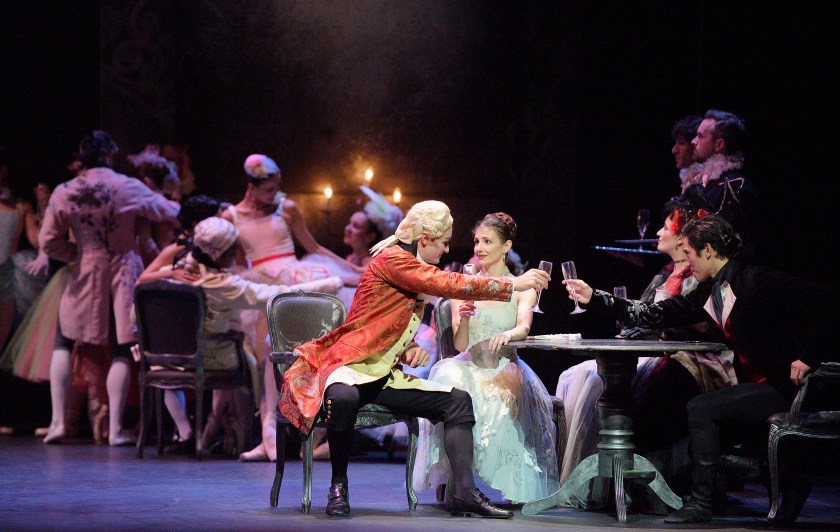
The dresses

Brightly coloured frou-frou dresses with their frills, flounces and ruffles fill the stage in Act II. Vibrant pinks, reds, yellows, greens and blues vie for attention with lustrous whites. The girls are adorned with cute hats and fascinators. A sense of light and fun pervades. And into this hive of colour and light walks Manon in her shimmering white cloak and gown bringing a focal point to the drama that radiates over the stage.
This atmosphere of frivolity and youthfulness never returns to Manon. So, in our opinion, the costumes in this scene in all their decorativeness and blasts of colour serve a crucial purpose in highlighting the mood of this scene, which seems so distant from the dark drama of the ensuing scenes.
Manon Designs Then
Ballet productions are regularly redesigned to give them a fresh “look”, or when a work is taken into the repertoire of a different company. Frederick Ashton’s 1948 Cinderella has acquired fresh sets and costumes several times over the years, while Birmingham Royal Ballet and La Scala Milan all have their own designs for MacMillan’s Romeo and Juliet (1965).
The nineteenth century classics are sometimes retained in the same production for decades, as in the case of Anthony Dowell’s Swan Lake, replaced by Liam Scarlett’s production last year only after thirty-one years. And a new production comes with a new design concept, which can suggest new meanings to the viewer.
The Royal Ballet has kept Nicholas Georgiadis’ original sets and costumes for Manon, perhaps because choreographer and designer were frequent collaborators, working together over a substantial period of MacMillan’s choreographic career. In addition to Manon, notable collaborations were The Burrow (1958), The Invitation (1960) Romeo and Juliet, and Mayerling (1978).
Like Romeo and Juliet, Manon is a work performed by companies across the globe, including Australian Ballet, The Mariinsky and Paris Opera Ballet. Mia Stensgaard is not the first to have created new designs for the ballet, but Peter Farmer’s sets and costumes for the Australian and Mariinsky Companies strike us as closer to Georgiadis’ original concept than Stensgaard’s version of Manon’s world. So let’s have a look at why that might be …
The rags
In the tradition of Diaghilev’s Ballets Russes, such an influence on the development of British ballet, MacMillan believed that design was absolutely integral to the identity and meaning of a choreographic work (Woodcock, 19). One of the aspects of Manon’s story that he felt passionate about and wanted to convey in no uncertain terms was the poverty that was a driving force in her life and the decisions that she makes. Therefore, crucial to Georgiadis’ décor is a cyclorama of rags cascading down the full height of the stage space. Characters emerge on to the stage through these rags from their carriages, representing the poverty that divides the population of Manon: the Beggars and the Gentlemen; Des Grieux and Monsieur G.M.; the Gaoler and the deported Prostitutes. Manon herself is a liminal character, who in the course of the ballet inhabits different worlds according to the decisions she makes. But the rags are a recurring reminder of how fragile the border is between survival and destitution.
The richness
Critics have highlighted how rich the original designs are compared to Stensgaard’s more recent offerings, which in comparison can look quite sparse. The word “sumptuous” has been used to describe both the costumes (Clarke 31) and the sets (Mead). There are undoubtedly a number of reasons for this, the first being Georgiadis’ style. Consider the splendour of the ballroom scenes in both Romeo and Juliet and Mayerling for example. You will probably be less familiar with his designs for Rudolf Nureyev’s Nutcracker (1968), which have been described by critic and historian Jack Anderson as “far too grand”, “autumnal” and “somber” (168).
Manon was created for the UK’s premiere ballet venue – the Royal Opera House in London – and as full-evening narrative ballet of high drama, a certain degree of ostentation would be expected. But also, in terms of the subject matter, Manon is a sombre tale, so that a heaviness of tone and hue – the burnt orange, dark brown and olive greens worn by Lescaut’s Mistress, for example – seems appropriate. And the richness of the costumes makes for a thought-provoking contrast with the rags of the cyclorama.
The dress
Despite the fact that we love Stensgaard’s designs for Act II, and Manon’s light luminous dress is both in keeping with the colour palette and marks her out as the jewel in the crown onstage, we miss Georgiadis’ glorious gown for Manon. Here she is at her most ravishing. As she whirls seductively through her solo with Des Grieux and Monsieur GM circling around the rest of cast freezes. The solo crystallises Manon’s predicament and the choices available to her. And the dress with its ornate black lace embellished with silver detail complements her tantalising but perturbing dance.
Georgiadis’ sets undoubtedly emphasise the gulf between the haves and the have-nots, in accordance with the choreographer’s wishes. In Stensgaard’s designs this theme is perhaps not so prominent. However, characterisation, drama and atmosphere, all vital to MacMillan’s oeuvreare writ large in her costumes and sets. In our opinion, we are really fortunate to have both of these productions in the British ballet repertoire. With two such distinct design concepts, the choreography is enriched, opening further opportunity for insight and interpretation from performers and audiences alike.
Next time on British Ballet Now and Then… March sees the world premiere of Cathy Marston’s new ballet Victoria commissioned by Northern Ballet to commemorate the bicentenary of the monarch’s birth. So we will be discussing bio-ballets with some thoughts on this new work and Kenneth MacMillan’s Mayerling based on the life of Crown Prince Rudolf of Austro-Hungary.
© British Ballet Now and Then
References
Anderson, Jack. The Nutcracker Ballet. Bison Books, 1979.
Clarke, Mary. “Manonin Copenhagen”, The Dancing Times, vol. 93, no. 1113, 2003, pp. 31-33.
MacMillan, Deborah. “Manon”. Manon, English National Ballet, Oct.-Nov. 2018.
Mead, David. “Jurgita Dronina Spellbinding in English National Ballet’s Manon”, SeeingDance, 4 Oct. 2018, http://www.seeingdance.com/enb-manon-26102018/. Accessed 21 Jan. 2019.
Woodcock, Sarah C. “MacMillan and Design”, The Dancing Times, vol. 93 no. 1108, 2002, pp. 19-25.

I enjoyed reading this post so much. My favourite part is the make-up section because when I went to the performance, I was questioning why the male dancers were so pale in Act II. I also noticed that in Act III, on the deported ladies’ dresses, they had numbers written on their backs that seemed to fade away; it was wonderful to see how detailed the costumes were. Lastly, I could not agree more with the article’s conclusion!
LikeLike